Brand
Picardo’s logo, colors and type.
Logo files for press and partners, and the few rules that keep the name looking like itself. Questions about using it? Email support@picardo.health.
01
Logo
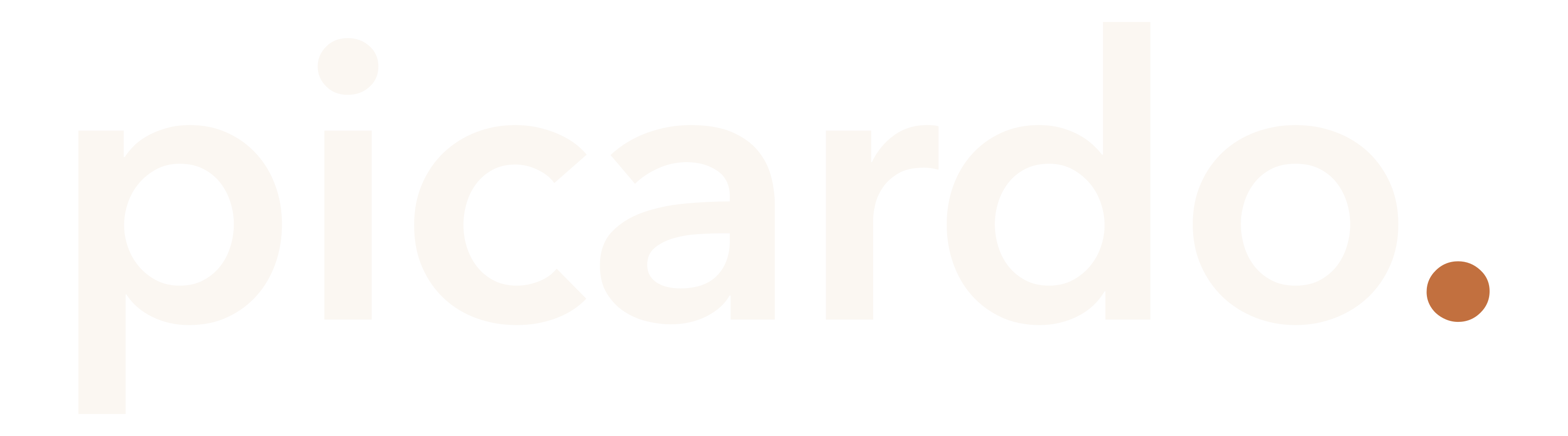
The wordmark is the logo. Use espresso on light backgrounds and cream on dark ones. Each comes as a vector SVG, or a 3200 × 890 PNG with a transparent background.
02
Wordmark
The name is set in type, not drawn: lowercase picardo in Avenir Next, with a terracotta period. The period is part of the mark, not punctuation. There’s no separate symbol.
- Typeface
- Avenir Next Demi Bold
- Case
- Lowercase, always
- Tracking
- −1% (−0.01em)
- Letters
- Espresso, or cream on dark
- Period
- Terracotta, on every background
- Smallest
- 120 px wide on screen
Using it
- Use the files on this page. The wordmark is outlined type, so don’t retype it in a font.
- Espresso on light backgrounds, cream on dark ones. The period stays terracotta on both.
- Leave clear space around it at least the height of the letter o.
- Below 120 px wide, use the app icon instead.
- In a sentence, the name is Picardo: capital P, no period. The lowercase form belongs to the logo.
What not to do
03
Color
Warm paper, espresso ink and one terracotta accent. There’s no pure black anywhere: espresso reads as black in text and keeps its warmth at large sizes. Click or tap a hex value to copy it.
Bone
The page. Our background wherever you’d reach for white.
Cream
Text and the logo on dark panels.
White
Cards that sit on bone. The only pure white.
Espresso
Text, the logo and primary buttons. Our black.
Terracotta
The accent: the logo’s period, link underlines, headline accents and icons.
Supporting
- Ink soft Body paragraphs
- Ink muted Captions and labels
- Hairline Rules and card borders
- Ink band Dark panels, fading to espresso
- Terracotta deep Terracotta for small text on white
- Peach Focus rings, and nothing else
- Terracotta is the accent: the logo’s period, link underlines, a headline’s accent line and icons. Small text takes terracotta deep, which stays readable.
- Terracotta never fills a button, and pure black (#000) never appears at all.
04
Type
Three typefaces, each with one job. Avenir Next and Seravek come with Apple devices; everywhere else, use the free stand-ins on Google Fonts.
Display
Avenir Next
Headlines at Medium (500), never bold. The wordmark at Demi Bold (600).
Stand-in: Nunito Sans
Text
Seravek
Body copy, buttons and labels on picardo.health, at Regular (400) and Medium (500). The Picardo app sets text in Inter.
Stand-in: Source Sans 3
Data
System mono
Numbers, units, reference ranges and dates. Never running copy. The Picardo app uses JetBrains Mono.
SF Mono on Apple devices
In use
We are building concierge medicine for everyone, powered by AI.
Your ApoB is down to 78 mg/dL since your last draw — inside the range your clinician set.
- Sentence case for headings, buttons and labels. Capitals only for small labels like the ones on this page.
- Numbers, units and dates go in mono, a size smaller for units.
- No italics, and no bold words inside a heading.
- No emoji or exclamation marks.